Modernizing provider discovery and booking for a large healthcare provider
Before - Landing Page
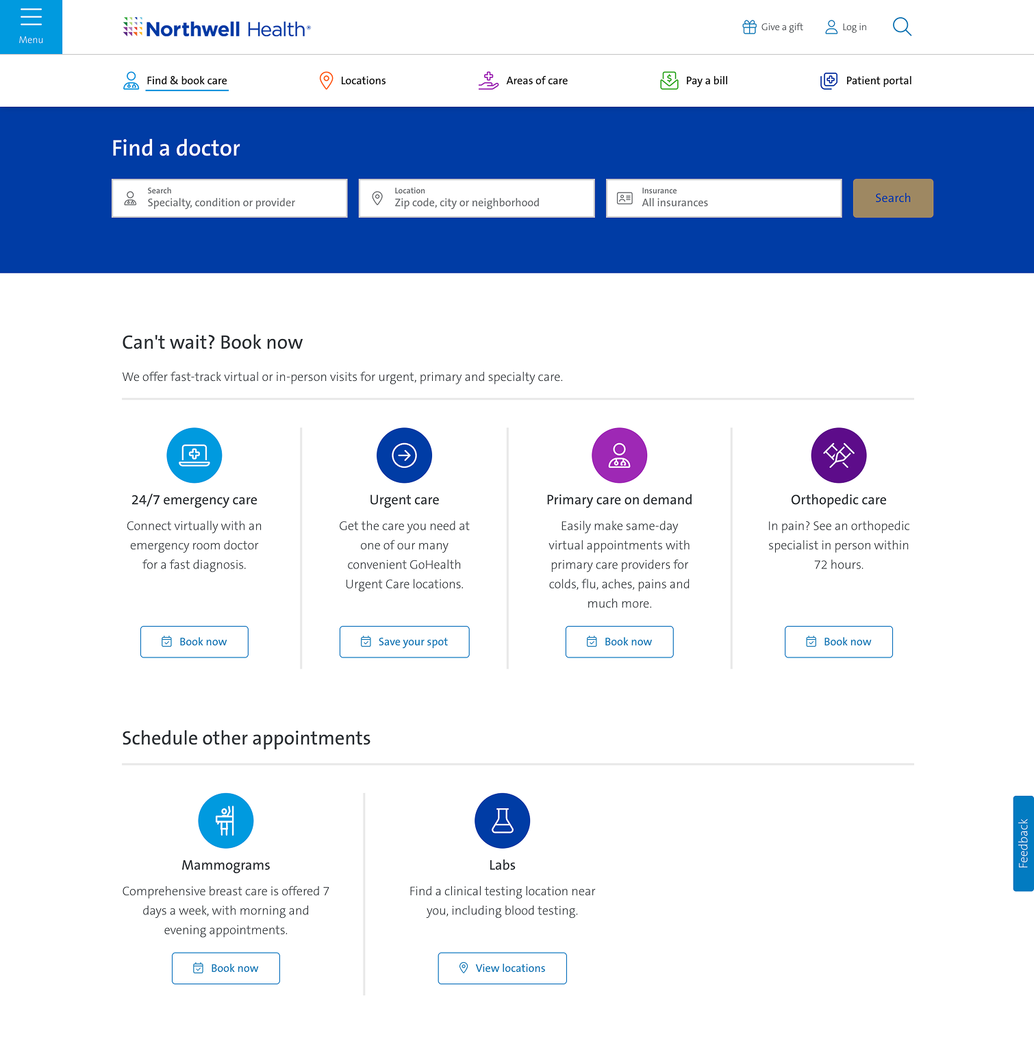
Before - Landing Page
The Project
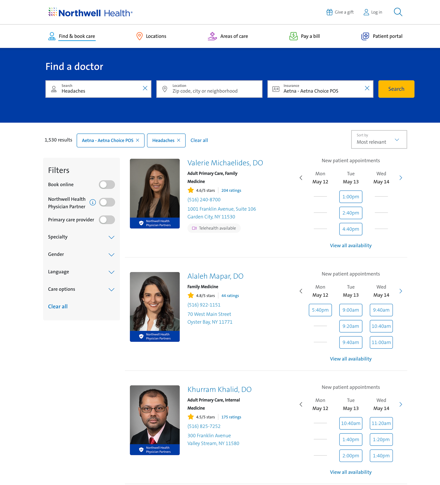
Northwell Health’s existing provider search experience was outdated and under-built. It consisted of a thin search page, a results page with no map or booking capability, and a provider profile page that was difficult to navigate. I partnered with one other designer to redesign the full experience end to end, introducing new functionality and two distinct visual directions for the client to evaluate.
The Problem
The original experience offered little beyond a basic search bar. Results lacked a map, booking required navigating away entirely, and there was no way to see telehealth availability. The provider page itself was hard to scan and impossible to navigate quickly.
Search
Interactive map added
Direct booking via modal. See availability and book without leaving the page
Clear telehealth availability indicators
What we built
Landing Page
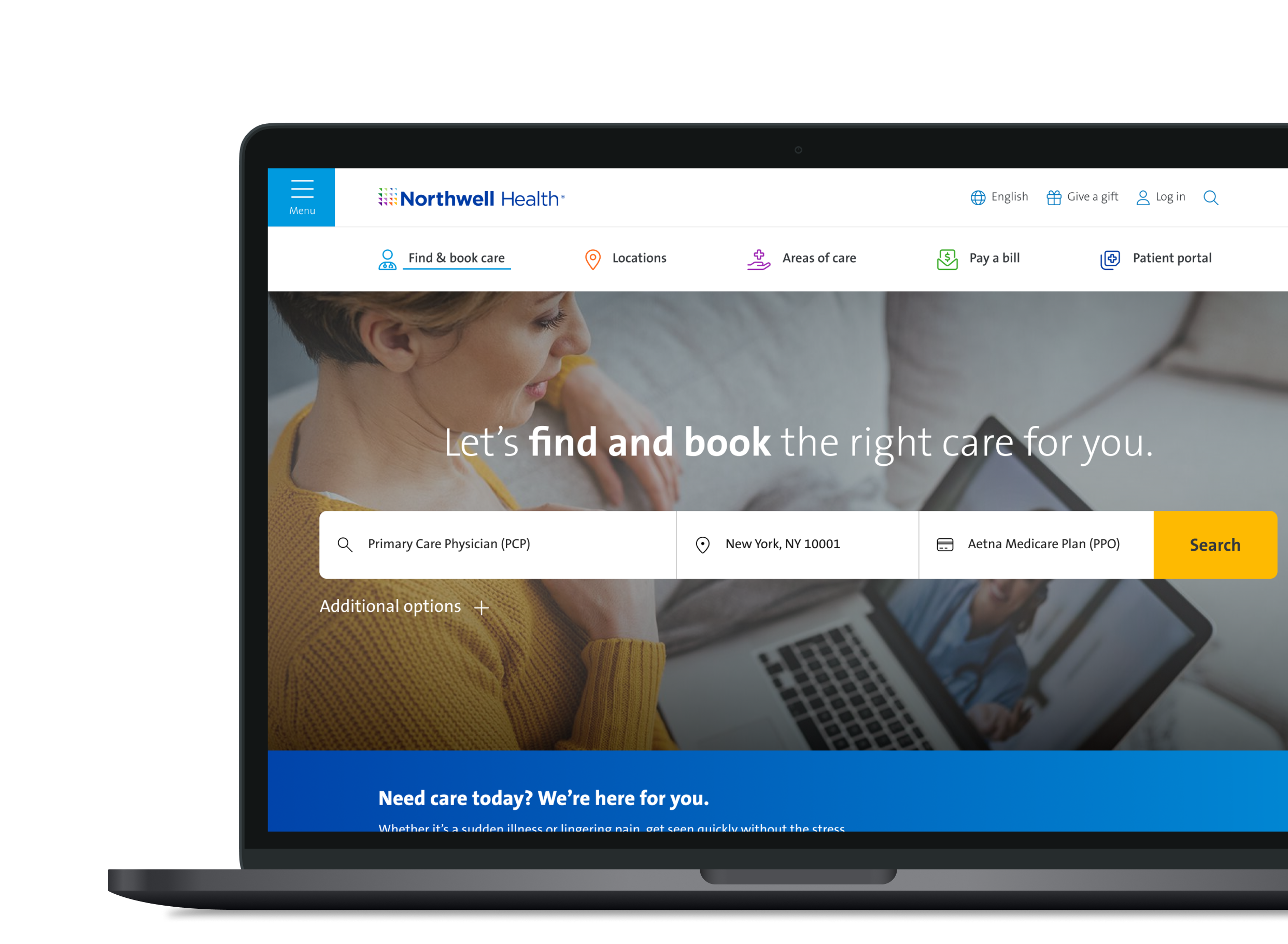
Modernized, sleeker search bar
New tappable quick-access tabs for types of care, common conditions, and specialties. Letting users search without typing at all
Provider Page
Sticky left-hand navigation for jumping between sections
Fully scrollable, organized layout
Two directions, one decision
We presented two design directions carrying identical functionality. Version A pushed the brand forward with bolder, more modern patterns — gradients and updated button styles. Version B delivered the same features within the client's existing visual language. The client selected Version B to maintain consistency with the rest of their site.
Version A
Version B